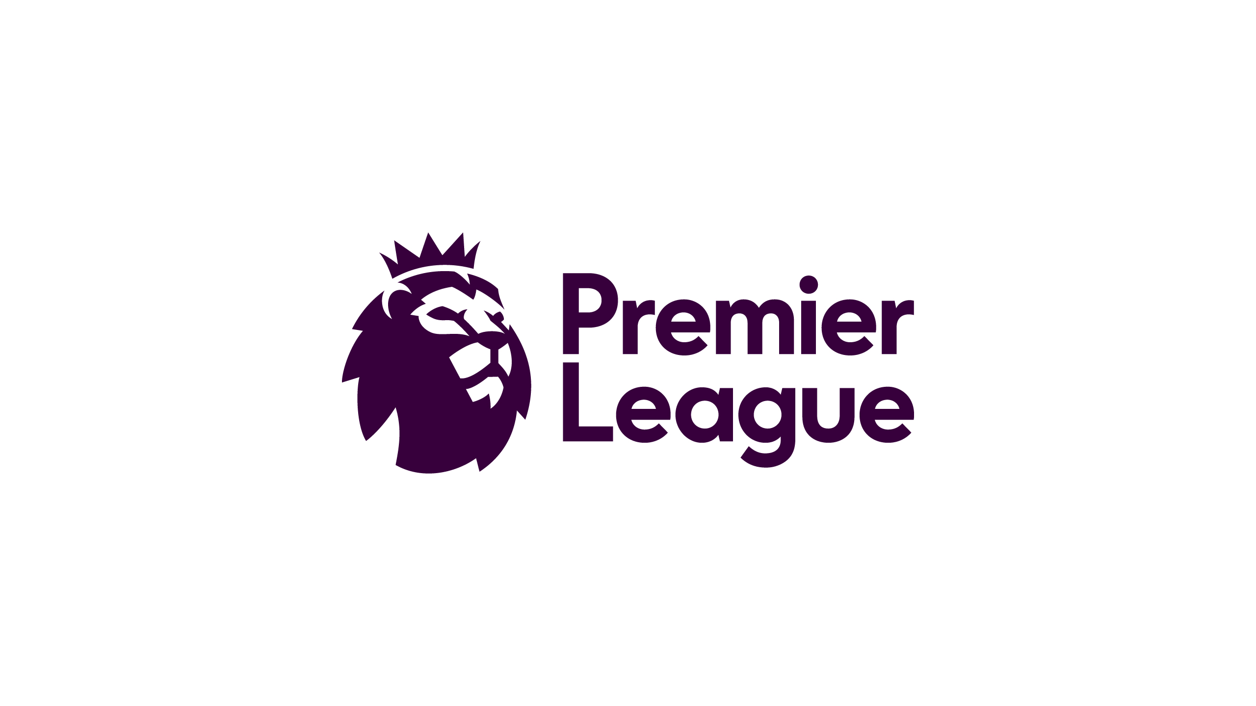
The Premier League revealed the logos that will be used from the 2016-2017 season onwards as fans took to Twitter to express their displeasure.
Starting next season, the Premier League will no longer have Barclays — or indeed any other brand — as title sponsors. As such, the competition will simply be known as the ‘Premier League’ rather than the ‘Barclays Premier League’ from next season onwards.
Sky Sports quotes Premier League managing director Richard Masters as saying: “From next season, we will move away from title sponsorship and the competition will be known simply as the Premier League, a decision which provided the opportunity to consider how we wanted to present ourselves as an organisation and competition.”
“We are very pleased with the outcome: a visual identity which is relevant, modern and flexible that will help us celebrate everyone that makes the Premier League.”
However, the Premier League’s fans don’t seem to share that sentiment, with the new logo largely being ridiculed on social media. Even England legend and BBC pundit Gary Lineker offered his typically pithy comments on the designs, sarcastically claiming he was ‘overwhelmingly excited’ upon looking at them.
From next season, the Premier League is going to look a little bit different…https://t.co/4n4mNohG2Z
— Premier League (@premierleague) February 9, 2016
Read more about the Premier League’s new look: https://t.co/FF56pOFlS9 pic.twitter.com/fCursGNkyQ — Premier League (@premierleague) February 9, 2016
Overwhelmingly excited to see the Premier League’s new logo. I mean, look at his face, just look at his face. pic.twitter.com/utkMVahyi9
— Gary Lineker (@GaryLineker) February 9, 2016
The New Premier League logo looks like a really bad acid trip lol. pic.twitter.com/fZLwBlbItj — Bryan McGuire (@Bryanx54) February 9, 2016
The new Premier League logo somehow looks like some kids cartoon show featuring lions.
— Habee Affandy (@HabeeAffandy) February 9, 2016
Not the best day for @premierleague to promote its new logo as protests over ticket prices intensify. #nero — Henry Winter (@henrywinter) February 9, 2016
The new Premier League logo looks week asf. It’s horrible!
— Johnny (@e10hazard) February 9, 2016
“@SundayLeagueFC: What do you think of the new Premier League branding? pic.twitter.com/GuF4rC3MCw” Dreadful…..somebody got paid to do that? — Bridgette Parlma (@Bparlma) February 9, 2016
That new premier league logo is very average.
— Ninja Samurai (忍者) (@verbstract) February 9, 2016
The new premier league logo is shit. — Cliff Brooks (@trojancliff) February 9, 2016
Looks like the new Premier League logo’s have been made in paint.
Pretty disappointing. pic.twitter.com/lwwTyz7Kj3
— Soccer St. (@SoccerSt_) February 9, 2016
Upside down, the new Premier League logo looks kinda like a fitting tribute to Lemmy pic.twitter.com/azljdICqD7 — Nooruddean (@BeardedGenius) February 9, 2016
Good of the @premierleague to pay respect to Cecil the Lion in the new logo.
— Ben McAleer (@BenMcAleer1) February 9, 2016
How the new Premier League logo should have been unveiled https://t.co/5pPWus2BLa — Bleacher Report UK (@br_uk) February 9, 2016
